"95fdaf16012263fa"{"id":"1002311","slug":"circle-damage-indicator-component","title":"Circle Damage Indicator Component","category":"Widgets \u0026 Controls","engine":"4.16+,5.0+","assetVersion":"","engineVersion":"Engine Version: 4.16+,5.0+","tag":"Widgets \u0026 Controls","accent":"blue","visual":"mech","summary":"A circular HUD damage indicator with dynamic and static modes, adjustable fade speed, color, custom textures, near-damage distance, scale, and screen position.","platform":"Unreal Engine","indexPolicy":"index","publishedAt":"2026-11-06T06:13:47.602Z","updatedAt":"2026-11-06T06:13:47.602Z","sourceNotes":[],"fileContents":[],"compatibility":["Unreal Engine","Engine Version: 4.16+,5.0+"],"featuredImage":{"alt":"Circle Damage Indicator Component","src":"/wp-content/uploads/published/2026/11/e59f95423c2d-cee698d1-8ed3-4367-8388-90f534069ae7-234cdda7ed.webp"},"hasDownloadLink":true,"downloads":0,"terms":[{"taxonomy":"category","slug":"widgets-and-controls","name":"Widgets \u0026 Controls"}],"galleryImages":[{"src":"/wp-content/uploads/published/2026/11/ffcefa786a75-1703c2c6-121e-458f-bec0-ab00a44405be-f4c58ad6f7.webp","alt":"Circle Damage Indicator Component"},{"src":"/wp-content/uploads/published/2026/11/c3e0dedb6ffb-ddc523a2-f951-4e3e-8c55-b659a758d6f1-3b1268cc5c.webp","alt":"Circle Damage Indicator Component"},{"src":"/wp-content/uploads/published/2026/11/a83098728ec5-c2845305-ae1a-43f3-8c82-d9bccf60c21c-7d648f9ae6.webp","alt":"Circle Damage Indicator Component"},{"src":"/wp-content/uploads/published/2026/11/efc0123b3c26-29e3b6a9-a1b3-4d42-938c-41bbd7a61cdf-0bb469653b.webp","alt":"Circle Damage Indicator Component"},{"src":"/wp-content/uploads/published/2026/11/148113f27121-0ad17675-995e-4465-b5ae-497ea5807eba-177e37427c.webp","alt":"Circle Damage Indicator Component"}],"accessPanel":{"kind":"resource","title":"Get this resource","eyebrow":"Free resource","message":"3DCGHUB is the service provider for this listing. Access is fulfilled through the official publisher channel.","fileName":"Content.7z","safetyNote":"Resources are manually reviewed before listing to improve quality and reduce obvious risks.","actionLabel":"Get this resource","resourceType":"Resource archive","versions":[]},"contentHtml":"\u003cp\u003eA hit lands from the left, and a ring opens at the matching edge of the screen. Rotate the character and the mark follows the threat; take another hit from behind and a second arc appears. That behavior sits at the center of Circle Damage Indicator Component, a HUD element that shows where damage was dealt from and is set up in a minute.\u003c/p\u003e \u003cp\u003eThe component does not ask for a bespoke interface pass. It adds a circle-based damage readout to an existing HUD, then exposes the visual and spatial controls needed to make that readout fit the project. Two indicator modes carry most of the design decisions.\u003c/p\u003e \u003ch2\u003eThe Circle That Tracks or Holds Its Place\u003c/h2\u003e \u003cp\u003eDynamic mode treats the indicator as a live directional cue. The circle shows the direction of damage and keeps facing that direction even while the game character rotates. In practice, the player can turn toward or away from the source of a hit and the ring remains aligned with the threat rather than freezing at its original screen angle. That makes dynamic mode useful when the HUD needs to communicate ongoing spatial pressure, not just a single impact.\u003c/p\u003e \u003cp\u003eStatic mode takes the opposite approach. The indicator spawns when damage is dealt and stays static on the screen. It records where the hit came from at the moment it landed, then remains in that position. A static ring suits moments when the player needs a fixed snapshot of incoming fire, or when the HUD should preserve the location of a hit without continuously updating as the camera moves.\u003c/p\u003e \u003cp\u003eSwitching between the two modes is part of the component's setup rather than a separate system. That choice changes how the same circular graphic reads in play: one follows the damage direction, the other pins the damage event to the screen.\u003c/p\u003e \u003ch2\u003eNear-Damage Distance and Custom Textures\u003c/h2\u003e \u003cp\u003eThe component includes a function to determine damage dealt near your character. Its near-damage distance is customizable, so the threshold for close-range hits can be set to match the scale of a scene. A shooter with tight corridors may want a different near-damage range than a broader outdoor map, and the component leaves that distance open for adjustment instead of fixing it.\u003c/p\u003e \u003cp\u003eVisual identity comes through custom textures and custom sprite size. The default circular form can be replaced with a texture that matches a project's HUD language, whether that means a thin arc, a segmented ring, or a softer gradient. Sprite size is exposed separately, which allows the texture to be prepared at one resolution or proportion and then sized for the screen without treating the circle as a single fixed stamp.\u003c/p\u003e \u003cp\u003eColor is another direct control. A damage indicator often needs to sit inside an existing palette, warn without overpowering the rest of the HUD, or distinguish one type of hit from another. The component exposes color as a parameter, so the ring can be tuned to the interface rather than accepted as-is.\u003c/p\u003e \u003ch2\u003eFade Speed, Scale, and Screen Offset\u003c/h2\u003e \u003cp\u003eThe circle's disappearance is not locked to a single timing. Indicator vanishing speed is adjustable, which lets the mark linger long enough to register or clear quickly enough to avoid cluttering the screen. That timing matters in fast encounters where several hits can arrive in succession; the same ring can feel persistent or momentary depending on how its fade is set.\u003c/p\u003e \u003cp\u003eIndicator scale changes the ring's presence in the HUD. A smaller circle keeps the readout subtle, while a larger one makes the damage direction harder to miss. Position relative to the screen's center is the other spatial control. It allows the indicator to be pulled inward or pushed outward from the center point, which is useful when the HUD already has a crosshair, health bar, or other element occupying the middle of the screen.\u003c/p\u003e \u003cp\u003eThe available parameters cover:\u003c/p\u003e \u003cul\u003e\n\u003cli\u003eType of indicator\u003c/li\u003e\n\u003cli\u003eSpeed of the indicator's vanishing\u003c/li\u003e\n\u003cli\u003eColor\u003c/li\u003e\n\u003cli\u003eCustom textures\u003c/li\u003e\n\u003cli\u003eDistance for near damage\u003c/li\u003e\n\u003cli\u003eIndicator scale\u003c/li\u003e\n\u003cli\u003ePosition relative to the screen's center\u003c/li\u003e\n\u003cli\u003eCustom sprite size\u003c/li\u003e\n\u003c/ul\u003e \u003cp\u003eThose controls sit together in the component, so the visual result can be adjusted without building a separate widget from scratch. The combination of fade, scale, and offset shapes how aggressive or restrained the circle feels during play.\u003c/p\u003e \u003ch2\u003eOne-Minute Setup Inside a Blueprint Widget Workflow\u003c/h2\u003e \u003cp\u003eThe component is presented as a quick addition: add the HUD element, choose the indicator type, and set the parameters. That low setup cost is relevant for teams that already have a HUD and want directional damage feedback without opening a new UI production track. The component is tagged with Blueprint and Widget, placing it in a workflow where the HUD element can be dropped into a project and tuned through exposed values.\u003c/p\u003e \u003cp\u003eIts tags also cover GUI, Interface, FPS, First Person, Multiplayer, Shooter, and Damage. Those labels describe the kind of project where the circle is most immediately useful: a first-person or multiplayer shooter in which the player needs a fast read on incoming fire. In those games, a damage direction indicator is not decorative. It supports spatial awareness when the camera is fixed to the player's view and threats can arrive from outside the current sightline.\u003c/p\u003e \u003ch3\u003ePairing With Damage Text\u003c/h3\u003e \u003cp\u003eCompatibility is noted with Damage Text, another asset from the creator. The two serve different parts of the same feedback loop: a floating number communicates how much damage was dealt, while the circle communicates where it came from. A project that already uses Damage Text can add the directional ring without changing the underlying damage readout.\u003c/p\u003e \u003cp\u003eThe component's value is clearest when the HUD needs a compact, tunable damage direction cue rather than a full custom interface. Dynamic and static modes cover two different relationships between the player's rotation and the damage source; custom textures, color, sprite size, scale, fade speed, screen offset, and near-damage distance cover the visual and spatial adjustments around them. For a shooter HUD that needs the circle to appear, point toward the hit, and then clear, that set of controls is the practical center of the asset.\u003c/p\u003e\n\n\u003ch2\u003eContinue Browsing Similar Packs\u003c/h2\u003e\n\u003cul\u003e\n\u003cli\u003e\u003ca href=\"https://3dcghub.com/delayed-healthbar-system/\" rel=\"noopener noreferrer\"\u003eDelayed Healthbar System\u003c/a\u003e\u003c/li\u003e\n\u003cli\u003e\u003ca href=\"https://3dcghub.com/hqui-progress-bars/\" rel=\"noopener noreferrer\"\u003eHQUI: Progress Bars\u003c/a\u003e\u003c/li\u003e\n\u003cli\u003e\u003ca href=\"https://3dcghub.com/simple-screen-damage-indicator/\" rel=\"noopener noreferrer\"\u003eSimple Screen Damage Indicator\u003c/a\u003e\u003c/li\u003e\n\u003cli\u003e\u003ca href=\"https://3dcghub.com/rd-lighting-kit/\" rel=\"noopener noreferrer\"\u003eRD: Lighting Kit\u003c/a\u003e\u003c/li\u003e\n\u003cli\u003e\u003ca href=\"https://3dcghub.com/damage-text/\" rel=\"noopener noreferrer\"\u003eDamage Text\u003c/a\u003e\u003c/li\u003e\n\u003c/ul\u003e","contentTextLength":6196,"navigation":{"current":57,"total":4291,"previous":{"id":"1002312","slug":"crash-test-robot-dummy","title":"Crash Test Robot Dummy","category":"Characters \u0026 Creatures","platform":"Unreal Engine","updatedAt":"2026-11-06T06:15:02.722Z"},"next":{"id":"1002310","slug":"character-captain","title":"Character Captain","category":"Characters \u0026 Creatures","platform":"Unreal Engine","updatedAt":"2026-11-06T06:13:00.506Z"}},"relatedResources":[{"id":"15459","slug":"delayed-healthbar-system","title":"Delayed Healthbar System","category":"Widgets \u0026 Controls","engine":"5.0+","assetVersion":"Engine version: 5.0+","engineVersion":"5.0","tag":"Widgets \u0026 Controls","accent":"blue","visual":"audio","summary":"Enhance your game's user interface with the Delayed Healthbar System. This asset provides a ready-to-use solution for animated health bars, damage blips, and screen-space indicators.","platform":"Unreal Engine","indexPolicy":"index","publishedAt":"2026-03-12T09:07:20.000Z","updatedAt":"2026-04-19T15:44:46.000Z","sourceNotes":[],"fileContents":[],"compatibility":["Unreal Engine","Engine version: 5.0+"],"featuredImage":{"alt":"Delayed Healthbar System","src":"https://3dcghub.com/wp-content/uploads/2026/03/072782e5-1fcd-4671-915e-3f517fc8aea5.webp"},"hasDownloadLink":true,"downloads":0},{"id":"15480","slug":"hqui-progress-bars","title":"HQUI: Progress Bars","category":"Widgets \u0026 Controls","engine":"4.26+,5.0+","assetVersion":"Engine version: 4.26+,5.0+","engineVersion":"4.19","tag":"Widgets \u0026 Controls","accent":"blue","visual":"animation","summary":"HQUI: Progress Bars offers a robust set of highly customizable UMG components for developers. This pack features advanced settings, gradients, and automated interpolation to elevate your game's user interface.","platform":"Unreal Engine","indexPolicy":"index","publishedAt":"2026-03-12T09:09:48.000Z","updatedAt":"2026-04-19T15:44:46.000Z","sourceNotes":[],"fileContents":[],"compatibility":["Unreal Engine","Engine version: 4.26+,5.0+"],"featuredImage":{"alt":"HQUI: Progress Bars","src":"https://3dcghub.com/wp-content/uploads/2026/03/327a22db-0f44-410f-93b6-73bd636562cb.webp"},"hasDownloadLink":true,"downloads":2},{"id":"1000775","slug":"simple-screen-damage-indicator","title":"Simple Screen Damage Indicator","category":"Gameplay Features","engine":"5.4+","assetVersion":"","engineVersion":"Engine Version: 5.4+","tag":"Gameplay Features","accent":"blue","visual":"mech","summary":"A 100% Blueprint visual feedback system displaying a blood splatter overlay on hazard damage. Built for single-player prototyping with local multiplayer UI rend","platform":"Unreal Engine","indexPolicy":"index","publishedAt":"2026-07-28T18:07:04.744Z","updatedAt":"2026-07-28T18:07:04.744Z","sourceNotes":[],"fileContents":[],"compatibility":["Unreal Engine","Engine Version: 5.4+"],"featuredImage":{"alt":"Simple Screen Damage Indicator","src":"/wp-content/uploads/published/2026/07/5369eff53b58-641db878-ef1c-4892-ab16-112ae9023f3c-f070c8732a.webp"},"hasDownloadLink":true,"downloads":2}]}
Widgets & Controls
Circle Damage Indicator Component
A circular HUD damage indicator with dynamic and static modes, adjustable fade speed, color, custom textures, near-damage distance, scale, and screen position.
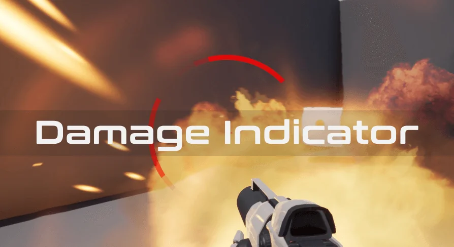
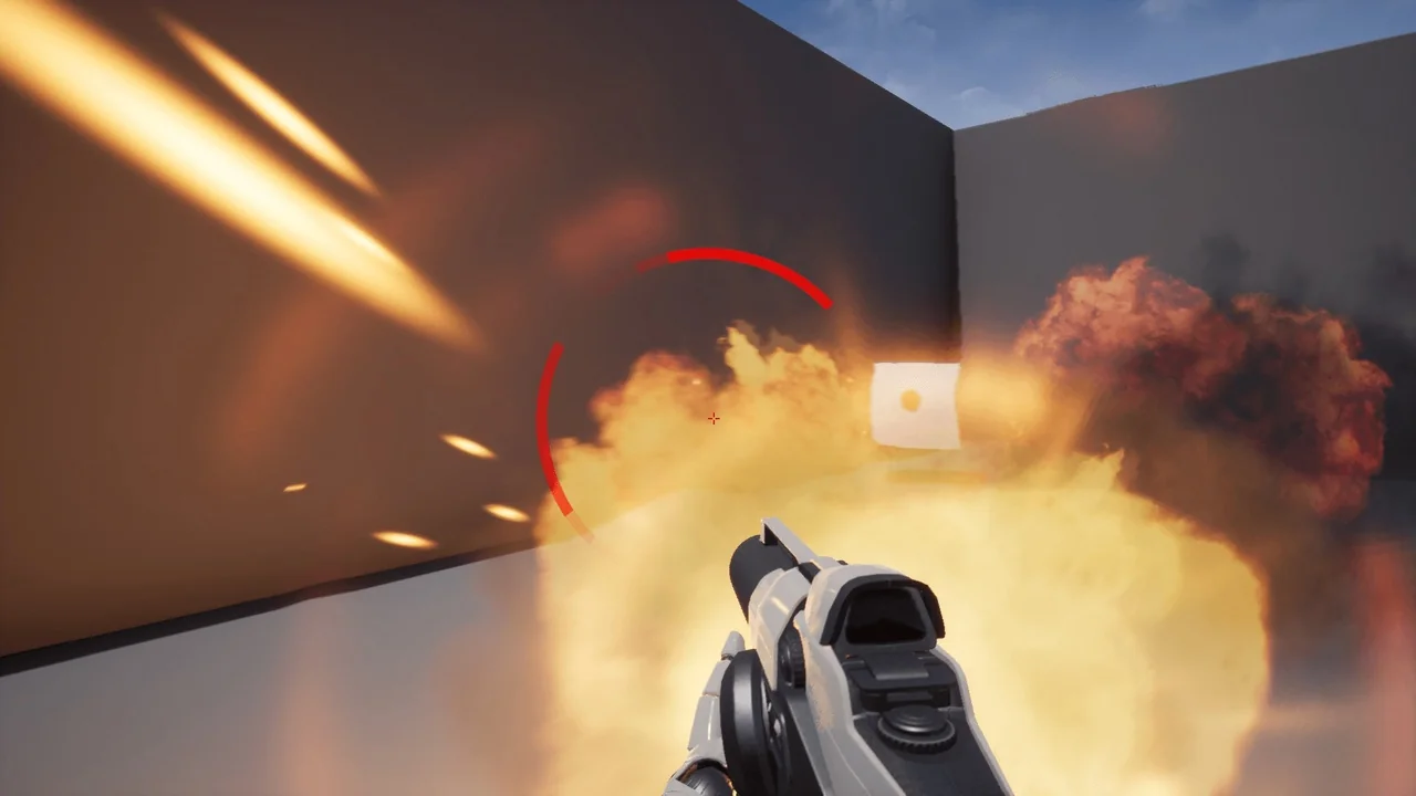
A hit lands from the left, and a ring opens at the matching edge of the screen. Rotate the character and the mark follows the threat; take another hit from behind and a second arc appears. That behavior sits at the center of Circle Damage Indicator Component, a HUD element that shows where damage was dealt from and is set up in a minute.
The component does not ask for a bespoke interface pass. It adds a circle-based damage readout to an existing HUD, then exposes the visual and spatial controls needed to make that readout fit the project. Two indicator modes carry most of the design decisions.
The Circle That Tracks or Holds Its Place
Dynamic mode treats the indicator as a live directional cue. The circle shows the direction of damage and keeps facing that direction even while the game character rotates. In practice, the player can turn toward or away from the source of a hit and the ring remains aligned with the threat rather than freezing at its original screen angle. That makes dynamic mode useful when the HUD needs to communicate ongoing spatial pressure, not just a single impact.
Static mode takes the opposite approach. The indicator spawns when damage is dealt and stays static on the screen. It records where the hit came from at the moment it landed, then remains in that position. A static ring suits moments when the player needs a fixed snapshot of incoming fire, or when the HUD should preserve the location of a hit without continuously updating as the camera moves.
Switching between the two modes is part of the component's setup rather than a separate system. That choice changes how the same circular graphic reads in play: one follows the damage direction, the other pins the damage event to the screen.
Near-Damage Distance and Custom Textures
The component includes a function to determine damage dealt near your character. Its near-damage distance is customizable, so the threshold for close-range hits can be set to match the scale of a scene. A shooter with tight corridors may want a different near-damage range than a broader outdoor map, and the component leaves that distance open for adjustment instead of fixing it.
Visual identity comes through custom textures and custom sprite size. The default circular form can be replaced with a texture that matches a project's HUD language, whether that means a thin arc, a segmented ring, or a softer gradient. Sprite size is exposed separately, which allows the texture to be prepared at one resolution or proportion and then sized for the screen without treating the circle as a single fixed stamp.
Color is another direct control. A damage indicator often needs to sit inside an existing palette, warn without overpowering the rest of the HUD, or distinguish one type of hit from another. The component exposes color as a parameter, so the ring can be tuned to the interface rather than accepted as-is.
Fade Speed, Scale, and Screen Offset
The circle's disappearance is not locked to a single timing. Indicator vanishing speed is adjustable, which lets the mark linger long enough to register or clear quickly enough to avoid cluttering the screen. That timing matters in fast encounters where several hits can arrive in succession; the same ring can feel persistent or momentary depending on how its fade is set.
Indicator scale changes the ring's presence in the HUD. A smaller circle keeps the readout subtle, while a larger one makes the damage direction harder to miss. Position relative to the screen's center is the other spatial control. It allows the indicator to be pulled inward or pushed outward from the center point, which is useful when the HUD already has a crosshair, health bar, or other element occupying the middle of the screen.
The available parameters cover:
Type of indicator
Speed of the indicator's vanishing
Color
Custom textures
Distance for near damage
Indicator scale
Position relative to the screen's center
Custom sprite size
Those controls sit together in the component, so the visual result can be adjusted without building a separate widget from scratch. The combination of fade, scale, and offset shapes how aggressive or restrained the circle feels during play.
One-Minute Setup Inside a Blueprint Widget Workflow
The component is presented as a quick addition: add the HUD element, choose the indicator type, and set the parameters. That low setup cost is relevant for teams that already have a HUD and want directional damage feedback without opening a new UI production track. The component is tagged with Blueprint and Widget, placing it in a workflow where the HUD element can be dropped into a project and tuned through exposed values.
Its tags also cover GUI, Interface, FPS, First Person, Multiplayer, Shooter, and Damage. Those labels describe the kind of project where the circle is most immediately useful: a first-person or multiplayer shooter in which the player needs a fast read on incoming fire. In those games, a damage direction indicator is not decorative. It supports spatial awareness when the camera is fixed to the player's view and threats can arrive from outside the current sightline.
Pairing With Damage Text
Compatibility is noted with Damage Text, another asset from the creator. The two serve different parts of the same feedback loop: a floating number communicates how much damage was dealt, while the circle communicates where it came from. A project that already uses Damage Text can add the directional ring without changing the underlying damage readout.
The component's value is clearest when the HUD needs a compact, tunable damage direction cue rather than a full custom interface. Dynamic and static modes cover two different relationships between the player's rotation and the damage source; custom textures, color, sprite size, scale, fade speed, screen offset, and near-damage distance cover the visual and spatial adjustments around them. For a shooter HUD that needs the circle to appear, point toward the hit, and then clear, that set of controls is the practical center of the asset.
 Widgets & Controls
 Widgets & Controls
 Widgets & Controls
 Gameplay Features