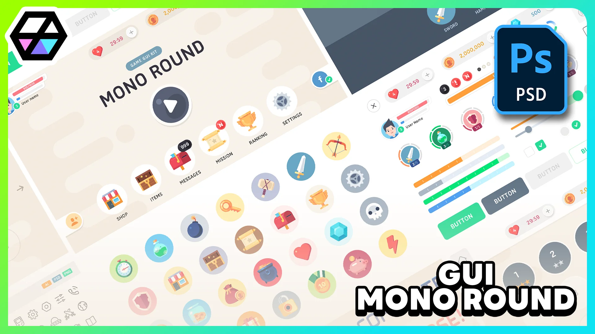
GUI - Mono Round
GUI - Mono Round delivers 1920x1080 interface graphics with 281+ PNG sources, 182 button icons, 28 PSD scenes, and editable UI parts for mobile-style HUD work.
 UI Kits / HUDs
Resource overview
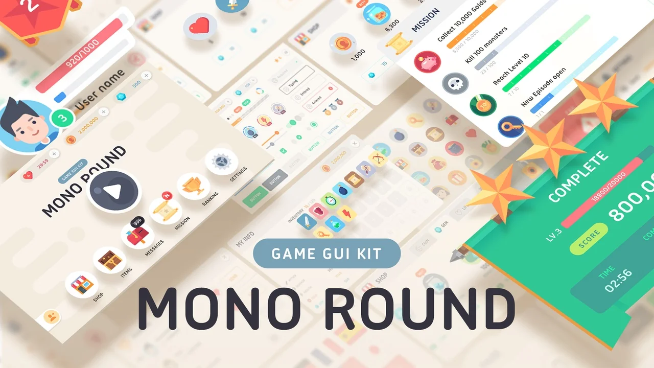
Rounded buttons, framed panels, labels, sliders, and popups give GUI - Mono Round A clear role inside a game screen: it helps shape menus and HUD layouts that feel simple, readable, and distinctly game-like rather than plain utility software. The visual direction points toward smartphone and mobile interface work, while the tags also place it close to cartoon, casual, fantasy, and RPG presentation. That combination makes it easy to picture the set in character menus, mission windows, inventory overlays, status panels, and touch-oriented menu flows where softness and clarity need to work together.
The asset stays focused on interface art rather than implementation. Coding and animation are not included, so the pack is best understood as a collection of visual building blocks and editable design files. For artists, UI designers, and developers assembling their own interface logic, that keeps the emphasis on arranging, adapting, and integrating the artwork into a broader production pipeline.
Mono Round on screen: soft UI shapes for mobile and fantasy menus
The name fits the pack well. The interface language leans on rounded forms and a clean, approachable look that can support user-facing screens without feeling harsh or overly technical. Tags such as Brown, White, Fantasy, Cartoon, Casual, and RPG Suggest a presentation that can bridge playful game UI and more thematic menu design. In practical use, that means the set can serve projects that want interface components to feel decorative enough for a game world while still remaining straightforward for players to read.
Because the resource includes frames, labels, buttons, sliders, and popups, it covers the kinds of parts that repeatedly appear across a menu system. Those are the components that define how a player moves through a title: selecting actions, reading short information blocks, confirming choices, or navigating layered screens. A rounded visual treatment helps those moments feel more tactile, especially in smartphone-oriented interfaces where touch targets and visual separation matter.
The inclusion of a Demo_UI Component also points toward presentation beyond isolated parts. Even without bundled coding or motion, there is enough here to think in terms of complete screen composition rather than just a pile of independent decorations.
1920x1080 graphics and the scope of the PNG set
The graphics are provided at 1920x1080 resolution, giving the pack a defined canvas size for layout work. All of the elements in the asset are available as PNG files, which keeps the artwork immediately usable for export, arrangement, and direct placement in interface mockups or game scenes.
The pack contains 281+ sources as PNG. That number matters less as a headline and more as an indicator of coverage: this is not limited to a handful of menu buttons. The included categories are broad enough to support the assembly of multiple screen types and menu states. The named UI groups are:
- UI Sliced Buttons
- Frames
- Labels
- Popups
- Sliders
- Demo_UI
- Icons
Sliced buttons are especially useful in a practical interface workflow because they suggest adaptable button construction beyond one fixed shape. Frames and labels help establish visual hierarchy around content blocks, while popups and sliders expand the set beyond static menu panels into common interaction patterns. A resource with those categories can support both primary navigation and secondary interface layers, such as options windows or short confirmation prompts.
Another small but important note is the treatment of Action Text. It is included as a PNG image. That keeps it visually consistent with the rest of the pack, but it also means teams should approach it as image-based interface art rather than live coded text unless they choose to rebuild or adapt it in their own workflow.
182 button icons and utility elements inside GUI - Mono Round
Icons often decide whether a GUI pack can carry an entire project or only cover a few menus. Here, 182 button icons Are included, each at 126x126. That gives the resource a substantial icon layer for repeated actions, menu categories, or symbol-based controls. In mobile and casual interfaces, icons do a lot of the work of keeping screens compact and immediately legible, so a larger icon count adds real practical range.
Beyond the main button icon collection, several utility elements are also listed by name:
- Hole
- Line_Black
- Line_Gray
- Line_Green
- Line_Orange
- Line_Whie
- Transpar_Black
- Transpar_Whie
These pieces are easy to overlook, yet they are often what help a UI artist finish a screen. Lines and transparent overlays can be used to separate interface zones, add contrast behind text, or create soft emphasis around active areas. Named color variations also suggest quicker assembly of alternate states or layered panel treatments without having to rebuild those accents from scratch. Even a simple element like a line or transparent block becomes valuable when a project needs consistency across many windows and menu panels.
Since the pack also includes icons alongside frames and labels, it supports interfaces that rely on both symbolic and textual cues. That is useful in RPG and casual game menus where an icon may identify a category while a label clarifies function.
28 PSD scenes with vector layers and a pictogram AI file
For teams that need editable design material rather than flat output alone, the pack goes further than PNG delivery. It includes 28 Scenes PSD Files with Vector layer, along with 1 pictogram icons AI File. Those editable files make the resource more flexible for interface customization and adaptation.
The PSD scene count suggests that the pack is not only a loose component library but also a more structured collection of prepared interface layouts or arrangements. Vector layers inside the PSD files are particularly useful when adjusting shapes, refining panel proportions, or keeping rounded forms clean during edits. That makes the resource easier to tune visually while staying close to its original style.
The AI file for pictogram icons adds another editable layer for icon-focused work. When a project needs icon revisions, style matching, or small symbol adjustments, having an editable pictogram source is far more practical than relying only on flat image exports. Combined with the PNG set, the editable files create a split workflow: immediate placement for speed, deeper editing when art direction changes.
Where the pack fits best in production
GUI - Mono Round Suits teams that want a ready visual base for interface assembly while keeping implementation in their own hands. The mobile and smartphone tags place it naturally in touch-friendly menu work, and the fantasy, cartoon, casual, and RPG tags give it a broad thematic lane within game UI. It is strongest when used as a visual toolkit for menus, HUD panels, popups, and slider-driven settings screens that need a rounded, approachable identity.
What it does not include is just as important: coding and animation are not part of the package. That means developers should approach it as interface art rather than a complete interactive system. For artists and UI builders, though, the combination of 1920x1080 PNG graphics, 281+ PNG sources, 182 button icons, 28 PSD scenes with vector layers, and one editable AI pictogram file gives it a clear practical value. The strongest takeaway is simple: this is a visual GUI set with enough breadth to assemble and adapt a full family of rounded mobile-style game screens.
Related Resources Worth Checking
Resource screenshots
10 curated preview images
Download this resource
Loading your download options...
Resources are manually reviewed before listing to improve quality and reduce obvious risks.
Related resources
 UI Kits / HUDs
 UI Kits / HUDs
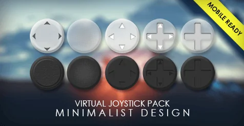 UI Kits / HUDs
Virtual Joystick Minimalist Pack
UI Kits / HUDs