"6f9bd6df1f44a86f"{"id":"1002291","slug":"advancedwidgetease","title":"AdvancedWidgetEase","category":"Animations","engine":"4.23+,5.0+","assetVersion":"","engineVersion":"Engine Version: 4.23+,5.0+","tag":"Animations","accent":"blue","visual":"animation","summary":"AdvancedWidgetEase tweens eight widget properties — move, scale, rotate, color, opacity and bezier — with 35 ease functions plus an example project for testing.","platform":"Unreal Engine","indexPolicy":"index","publishedAt":"2026-11-04T05:20:11.578Z","updatedAt":"2026-11-04T05:20:11.578Z","sourceNotes":[],"fileContents":[],"compatibility":["Unreal Engine","Engine Version: 4.23+,5.0+"],"featuredImage":{"alt":"AdvancedWidgetEase","src":"/wp-content/uploads/published/2026/11/a7bd847698fb-a2cc2bf5-925d-4e94-9dad-06e5b9451457-d6515eb7e6.webp"},"hasDownloadLink":true,"downloads":0,"terms":[{"taxonomy":"category","slug":"animations-game-systems","name":"Animations"}],"galleryImages":[{"src":"/wp-content/uploads/published/2026/11/0946b5cd8b07-1883993b-3f16-44f6-936c-7a07a53b1a07-782a07b7f3.webp","alt":"AdvancedWidgetEase"},{"src":"/wp-content/uploads/published/2026/11/8c6778bed59c-4c46e997-2baf-4393-b335-118ba025d34a-242d42bf7d.webp","alt":"AdvancedWidgetEase"},{"src":"/wp-content/uploads/published/2026/11/57583d422032-a4ef9ece-73b7-49dc-b419-3062f627e0f7-19496e7514.webp","alt":"AdvancedWidgetEase"},{"src":"/wp-content/uploads/published/2026/11/41ca8cebad90-073f14ea-dbe9-431f-b4b6-bf5b801bb28c-780b197698.webp","alt":"AdvancedWidgetEase"},{"src":"/wp-content/uploads/published/2026/11/35ba24492b37-ced3ac1f-7d51-4847-b1f3-799f23cb22d6-c3ffec1661.webp","alt":"AdvancedWidgetEase"},{"src":"/wp-content/uploads/published/2026/11/1e5440e816e1-95f4886f-2aeb-422e-bb14-c2f016cce97b-4407c55eb2.webp","alt":"AdvancedWidgetEase"}],"accessPanel":{"kind":"resource","title":"Download this resource","eyebrow":"Free Download","message":"Log in or create a free account to start your download.","fileName":"Content.7z","safetyNote":"Resources are manually reviewed before listing to improve quality and reduce obvious risks.","actionLabel":"Download Free","resourceType":"Resource archive"},"contentHtml":"\u003cp\u003ePopup menus, pause panels and HUD strips usually arrive on screen with a cut. AdvancedWidgetEase exists to replace that cut with motion — tween actions that carry a widget from one state to another instead of letting it appear and vanish instantly. The scenes it serves are the ordinary ones in a menu build: a shop panel that slides and fades in, a button that scales under the cursor, a tooltip that eases into place beside its icon, a status label that shifts color when something changes.\u003c/p\u003e \u003cp\u003eEight widget properties can be tweened. Six are named directly — move, scale, rotate, color, opacity and bezier — which covers the parts of a widget that most transitions actually touch: where it sits, how large it is, what angle it holds, what tint it carries, how transparent it is, and how it travels along a curve rather than a straight line. Any tween action can be assembled from those properties, so one transition is free to combine several of them at once instead of animating a single value in isolation.\u003c/p\u003e \u003ch2\u003eMove, Scale, Rotate, Color, Opacity, Bezier\u003c/h2\u003e \u003cp\u003eEach property answers a different question during a transition. Move governs position, which is what makes an off-screen panel slide into frame. Scale governs size, useful for a press response or for a panel that grows from a small origin point. Rotate governs angle, and it is one of the properties called out in the asset's own tags alongside Transform and Scale, which suggests rotation is treated as a first-class part of the set rather than an afterthought.\u003c/p\u003e \u003cp\u003eColor and opacity work on appearance rather than placement. Color lets a widget's tint change over the duration of a tween, which reads well for state feedback — a highlighted row, a warning label, a button settling into its active look. Opacity handles fade, the cheapest way to soften an entrance or exit without moving anything. Bezier covers curved motion, so a widget can follow a path that bends instead of tracking a straight line between two points.\u003c/p\u003e \u003cp\u003eThe combination is where the tool does its real work. A panel that fades while it slides, a button that scales and rotates together, a notification that follows a bezier path while its color shifts — all of these are built from the same small property set, driven by the same tween action system.\u003c/p\u003e \u003ch2\u003eThirty-Five Ease Functions\u003c/h2\u003e \u003cp\u003eTiming decisions are handled by 35 tween ease functions. That count matters in a practical way: an ease curve is what separates a mechanical linear slide from a movement that starts quickly and settles, or one that hesitates and then releases. With 35 to choose from, the same move or scale tween can read as snappy, soft, weighty or abrupt depending on which curve drives it.\u003c/p\u003e \u003cp\u003eThe purpose stated for the ease set is straightforward — making an action more vivid. In a menu context that translates to transitions with a bit of character rather than uniform interpolation. Because the easing library is shared across all eight properties, a designer can keep a consistent motion personality across an entire interface: the same curve family applied to a panel's move, a button's scale and a label's opacity keeps the screen feeling like one system instead of a collection of separately tuned pieces.\u003c/p\u003e \u003ch2\u003eTesting Actions Inside the Project\u003c/h2\u003e \u003cp\u003eAn example is included in the project so the tween actions can be tried out directly. That is a practical arrangement for this kind of tool. Ease curves are hard to judge from a list of names or a numeric description — the difference between two similar-looking functions only becomes obvious when a widget is actually moving on screen. Having the example inside the project means each action can be triggered and watched, and the curve that fits a particular panel can be picked by eye rather than by guesswork.\u003c/p\u003e \u003cp\u003eWorking from an existing example also shortens the gap between trying something and shipping it. Once a transition reads correctly in the example, the same action setup carries over to the real menu widgets.\u003c/p\u003e \u003ch2\u003eBlueprint, Code and the Rest of the Tag Set\u003c/h2\u003e \u003cp\u003eThe asset is tagged with Design, Rotate, Scale, Project, Maple, Transform, Blueprint and Code. Read together, that describes a tool that sits in the interface and implementation layer rather than the modeling pipeline — it is about transforming widgets in real time, wired up through Blueprint and backed by code. Widget motion set up in Blueprint is useful precisely because menus change often: a transition can be adjusted without a rebuild of the surrounding systems.\u003c/p\u003e \u003cp\u003eCompatibility is noted for SpherePopupMenu, which places the tool neatly alongside popup menu work — the exact context where slide, fade and scale transitions are most visible to a player. Popup panels are also where a bad transition is most noticeable, since they occupy a large share of the screen and appear repeatedly. Tweening those panels with a considered ease curve makes the difference between a menu that feels assembled and one that feels authored.\u003c/p\u003e \u003ch2\u003eWhere It Belongs in a Menu Build\u003c/h2\u003e \u003cp\u003eAdvancedWidgetEase is aimed at teams already building their interface in Blueprint who want motion without hand-authoring each transition. Reach for it when a popup menu needs to enter and exit with a slide, fade or scale; when a button needs a press response; when a panel needs curved travel rather than a straight-line hop. The eight properties and 35 ease functions cover the ordinary vocabulary of interface motion, and the bundled example provides the space to settle on the right curve before the transition goes into the shipping screen.\u003c/p\u003e\n\n\u003ch2\u003eExplore Similar Assets\u003c/h2\u003e\n\u003cul\u003e\n\u003cli\u003e\u003ca href=\"https://3dcghub.com/daily-life-ai/\" rel=\"noopener noreferrer\"\u003eDaily Life AI\u003c/a\u003e\u003c/li\u003e\n\u003cli\u003e\u003ca href=\"https://3dcghub.com/breakdown/\" rel=\"noopener noreferrer\"\u003eBreakdown\u003c/a\u003e\u003c/li\u003e\n\u003cli\u003e\u003ca href=\"https://3dcghub.com/procedural-turn-in-place-system/\" rel=\"noopener noreferrer\"\u003eProcedural Turn in Place System\u003c/a\u003e\u003c/li\u003e\n\u003cli\u003e\u003ca href=\"https://3dcghub.com/smart-locomotion/\" rel=\"noopener noreferrer\"\u003eSmart Locomotion\u003c/a\u003e\u003c/li\u003e\n\u003cli\u003e\u003ca href=\"https://3dcghub.com/kai-locomotion-system/\" rel=\"noopener noreferrer\"\u003eKai Locomotion System\u003c/a\u003e\u003c/li\u003e\n\u003c/ul\u003e","contentTextLength":5622,"navigation":{"current":5,"total":4218,"previous":{"id":"1002292","slug":"ak-47-fpsk-ready","title":"AK-47 (FPSK Ready)","category":"Guns","platform":"Unreal Engine","updatedAt":"2026-11-04T05:21:02.045Z"},"next":{"id":"1002290","slug":"advanced-uav-pack","title":"Advanced UAV Pack","category":"Weapons \u0026 Combat","platform":"Unreal Engine","updatedAt":"2026-11-04T05:19:38.870Z"}},"relatedResources":[{"id":"1000262","slug":"daily-life-ai","title":"Daily Life AI","category":"Animations","engine":"4.26+,5.0+","assetVersion":"","engineVersion":"Engine Version: 4.26+,5.0+","tag":"Animations","accent":"blue","visual":"animation","summary":"An implementation guide to Daily Life AI, detailing its day/night cycle, behavior tree structure, hunger system, and drag-and-drop NPC routines.","platform":"Unreal Engine","indexPolicy":"noindex","publishedAt":"2026-06-30T23:06:12.448Z","updatedAt":"2026-06-30T23:06:12.448Z","sourceNotes":[],"fileContents":[],"compatibility":["Unreal Engine","Engine Version: 4.26+,5.0+"],"featuredImage":{"alt":"Daily Life AI","src":"/wp-content/uploads/published/2026/06/e147817c5ccf-a6a6198d-7c5a-4d60-bd9f-d08e7df2d365-79bd7785fd.webp"},"hasDownloadLink":true,"downloads":4},{"id":"1001505","slug":"breakdown","title":"Breakdown","category":"Animations","engine":"5.0+","assetVersion":"","engineVersion":"Engine Version: 5.0+","tag":"Animations","accent":"blue","visual":"animation","summary":"Create exploded views and level assembly sequences in Unreal Engine using Breakdown Blueprints, custom movement axes, and Datasmith meshes.","platform":"Unreal Engine","indexPolicy":"index","publishedAt":"2026-10-09T07:32:19.643Z","updatedAt":"2026-10-09T07:32:19.643Z","sourceNotes":[],"fileContents":[],"compatibility":["Unreal Engine","Engine Version: 5.0+"],"featuredImage":{"alt":"Breakdown","src":"/wp-content/uploads/published/2026/10/df94c91af314-1cce7dbf-eb1b-4212-b40a-9252e4c03615-a9e16cce87.webp"},"hasDownloadLink":true,"downloads":0},{"id":"1001011","slug":"procedural-turn-in-place-system","title":"Procedural Turn in Place System","category":"Animations","engine":"5.1+","assetVersion":"","engineVersion":"Engine Version: 5.1+","tag":"Animations","accent":"blue","visual":"animation","summary":"IK-based turn-in-place for UE4/UE5 humanoids with auto foot projection, customizable curves, strafing set, Control Rig setup, and replication.","platform":"Unreal Engine","indexPolicy":"index","publishedAt":"2026-08-22T13:14:55.097Z","updatedAt":"2026-08-22T13:14:55.097Z","sourceNotes":[],"fileContents":[],"compatibility":["Unreal Engine","Engine Version: 5.1+"],"featuredImage":{"alt":"Procedural Turn in Place System","src":"/wp-content/uploads/published/2026/08/58b7c31ef80f-667a563c-7f44-4f12-b33a-40d2aeab67cf-3a9009c480.webp"},"hasDownloadLink":true,"downloads":5}]}
Animations
AdvancedWidgetEase
AdvancedWidgetEase tweens eight widget properties — move, scale, rotate, color, opacity and bezier — with 35 ease functions plus an example project for testing.
Category:Unreal Engine,AnimationsPlatform: Unreal EngineEngine Version: 4.23+,5.0+Published: Nov 4, 2026
Animations
Resource overview
Popup menus, pause panels and HUD strips usually arrive on screen with a cut. AdvancedWidgetEase exists to replace that cut with motion — tween actions that carry a widget from one state to another instead of letting it appear and vanish instantly. The scenes it serves are the ordinary ones in a menu build: a shop panel that slides and fades in, a button that scales under the cursor, a tooltip that eases into place beside its icon, a status label that shifts color when something changes.
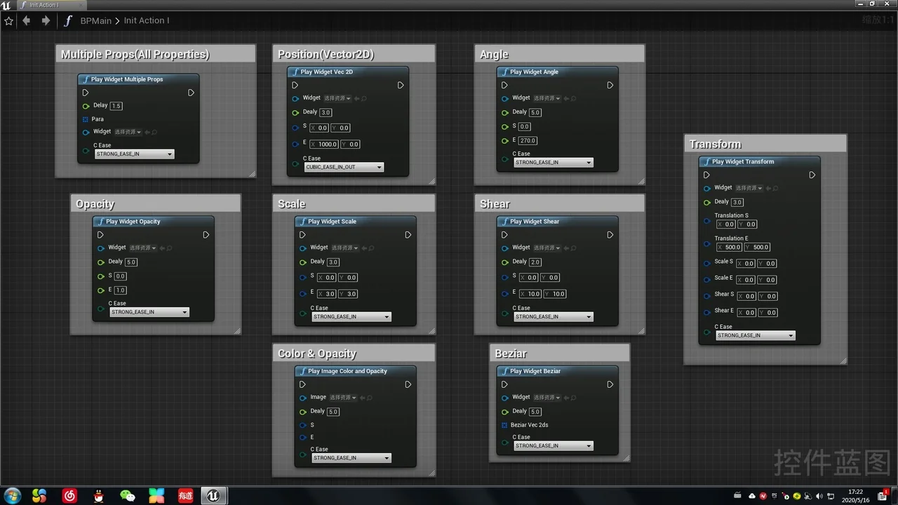
Eight widget properties can be tweened. Six are named directly — move, scale, rotate, color, opacity and bezier — which covers the parts of a widget that most transitions actually touch: where it sits, how large it is, what angle it holds, what tint it carries, how transparent it is, and how it travels along a curve rather than a straight line. Any tween action can be assembled from those properties, so one transition is free to combine several of them at once instead of animating a single value in isolation.
Move, Scale, Rotate, Color, Opacity, Bezier
Each property answers a different question during a transition. Move governs position, which is what makes an off-screen panel slide into frame. Scale governs size, useful for a press response or for a panel that grows from a small origin point. Rotate governs angle, and it is one of the properties called out in the asset's own tags alongside Transform and Scale, which suggests rotation is treated as a first-class part of the set rather than an afterthought.
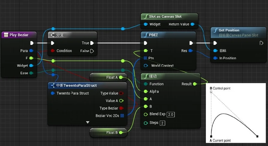
Color and opacity work on appearance rather than placement. Color lets a widget's tint change over the duration of a tween, which reads well for state feedback — a highlighted row, a warning label, a button settling into its active look. Opacity handles fade, the cheapest way to soften an entrance or exit without moving anything. Bezier covers curved motion, so a widget can follow a path that bends instead of tracking a straight line between two points.
The combination is where the tool does its real work. A panel that fades while it slides, a button that scales and rotates together, a notification that follows a bezier path while its color shifts — all of these are built from the same small property set, driven by the same tween action system.
Thirty-Five Ease Functions
Timing decisions are handled by 35 tween ease functions. That count matters in a practical way: an ease curve is what separates a mechanical linear slide from a movement that starts quickly and settles, or one that hesitates and then releases. With 35 to choose from, the same move or scale tween can read as snappy, soft, weighty or abrupt depending on which curve drives it.
The purpose stated for the ease set is straightforward — making an action more vivid. In a menu context that translates to transitions with a bit of character rather than uniform interpolation. Because the easing library is shared across all eight properties, a designer can keep a consistent motion personality across an entire interface: the same curve family applied to a panel's move, a button's scale and a label's opacity keeps the screen feeling like one system instead of a collection of separately tuned pieces.
Testing Actions Inside the Project
An example is included in the project so the tween actions can be tried out directly. That is a practical arrangement for this kind of tool. Ease curves are hard to judge from a list of names or a numeric description — the difference between two similar-looking functions only becomes obvious when a widget is actually moving on screen. Having the example inside the project means each action can be triggered and watched, and the curve that fits a particular panel can be picked by eye rather than by guesswork.
Working from an existing example also shortens the gap between trying something and shipping it. Once a transition reads correctly in the example, the same action setup carries over to the real menu widgets.
Blueprint, Code and the Rest of the Tag Set
The asset is tagged with Design, Rotate, Scale, Project, Maple, Transform, Blueprint and Code. Read together, that describes a tool that sits in the interface and implementation layer rather than the modeling pipeline — it is about transforming widgets in real time, wired up through Blueprint and backed by code. Widget motion set up in Blueprint is useful precisely because menus change often: a transition can be adjusted without a rebuild of the surrounding systems.
Compatibility is noted for SpherePopupMenu, which places the tool neatly alongside popup menu work — the exact context where slide, fade and scale transitions are most visible to a player. Popup panels are also where a bad transition is most noticeable, since they occupy a large share of the screen and appear repeatedly. Tweening those panels with a considered ease curve makes the difference between a menu that feels assembled and one that feels authored.
Where It Belongs in a Menu Build
AdvancedWidgetEase is aimed at teams already building their interface in Blueprint who want motion without hand-authoring each transition. Reach for it when a popup menu needs to enter and exit with a slide, fade or scale; when a button needs a press response; when a panel needs curved travel rather than a straight-line hop. The eight properties and 35 ease functions cover the ordinary vocabulary of interface motion, and the bundled example provides the space to settle on the right curve before the transition goes into the shipping screen.
 Animations
 Animations
 Animations
 Animations