"37dee670e12bf3e7"{"id":"1000132","slug":"post-soviet-flat","title":"Post Soviet Flat","category":"Interior","engine":"4.26+,5.0+","assetVersion":"","engineVersion":"Engine Version: 4.26+,5.0+","tag":"Interior","accent":"cyan","visual":"mech","summary":"Post Soviet Flat presents a worn Russian apartment scene made for the Twin Soul demo, with unified props suited to horror, adventure, and shooter work.","platform":"Unreal Engine","publishedAt":"2026-06-11T16:53:42.437Z","updatedAt":"2026-06-11T16:53:42.437Z","sourceNotes":[],"fileContents":[],"compatibility":["Unreal Engine","Engine Version: 4.26+,5.0+"],"featuredImage":{"alt":"Post Soviet Flat","src":"/wp-content/uploads/published/2026/06/a42634c967df-c670902c-e2a1-4ccc-8164-672756bfc4ba-f5e4e64dff.webp"},"hasDownloadLink":true,"pageviews":5,"galleryImages":[{"src":"/wp-content/uploads/published/2026/06/3ffa30e1e306-393d1a34-8b8a-4f1c-b3cf-a46061e5c44f-39740a6036.webp","alt":"Post Soviet Flat"},{"src":"/wp-content/uploads/published/2026/06/3ee9df8dc4d6-cdb54ca4-9a49-4f55-ab0e-f8fc508ea82a-17e495217c.webp","alt":"Post Soviet Flat"},{"src":"/wp-content/uploads/published/2026/06/4ef4520770af-0de7489f-9641-4b8b-90ab-8752c56622da-9649b5204c.webp","alt":"Post Soviet Flat"},{"src":"/wp-content/uploads/published/2026/06/e8b4f66cb36b-2dfdafd4-2424-4049-be8b-11a9ac8f41a4-fa900fae55.webp","alt":"Post Soviet Flat"},{"src":"/wp-content/uploads/published/2026/06/635fed657ef2-472eec31-c6c1-44e5-b928-d4229a744b37-3cc3878206.webp","alt":"Post Soviet Flat"},{"src":"/wp-content/uploads/published/2026/06/5085c179714e-d57d28bb-6f39-4142-a9a6-be7ffd5d5542-ad21d36e52.webp","alt":"Post Soviet Flat"},{"src":"/wp-content/uploads/published/2026/06/d155e3d60799-61087939-f6b1-4f6d-8e72-02c78a235d0a-a98a60a14b.webp","alt":"Post Soviet Flat"},{"src":"/wp-content/uploads/published/2026/06/dfbd87cde11e-2d9dfa52-ce81-4fce-88e5-73445457f78d-7a0c28f7b9.webp","alt":"Post Soviet Flat"},{"src":"/wp-content/uploads/published/2026/06/5bd0d67e5ebe-94b44059-d60c-4922-9b9f-a917ef65aef9-b128df1fec.webp","alt":"Post Soviet Flat"},{"src":"/wp-content/uploads/published/2026/06/53a9507a66da-df9b149e-e5b4-4dd5-acb1-8938afaf6455-50c525e484.webp","alt":"Post Soviet Flat"}],"accessPanel":{"kind":"resource","title":"Download this resource","eyebrow":"Free Download","message":"Log in or create a free account to start your download.","fileName":"Content.7z","safetyNote":"Resources are manually reviewed before listing to improve quality and reduce obvious risks.","actionLabel":"Download Free","resourceType":"Resource archive","sourceShortcode":"cryptomus_member"},"contentHtml":"\u003cp\u003eWhen a project needs an apartment that feels lived in rather than staged, \u003cstrong\u003ePost Soviet Flat\u003c/strong\u003e Offers a clear direction. The pack was developed for the \u003cstrong\u003eTwin Soul\u003c/strong\u003e Game demo and presents a flat based on real Russian standards, filled with objects suited to Russian life. That foundation gives artists and level designers a ready-made interior identity: not a neutral room set, but a specific domestic environment with a recognizable cultural and visual character.\u003c/p\u003e\n\u003cp\u003eThe scene language is equally important. Every object shown is made in one style, which helps the apartment read as a whole place instead of a collection of unrelated props. The pack also carries a slight weariness and dilapidation across all props, giving the environment a used, believable condition that naturally supports tension, mood, and narrative framing. For teams working on horror, adventure, or shooter projects, that kind of visual consistency can do a lot of work before any character even enters the room.\u003c/p\u003e \u003ch2\u003ePost Soviet Flat and the shape of a believable apartment\u003c/h2\u003e\n\u003cp\u003eThe central appeal here is its focus on a flat built according to real Russian standards. That phrase points to more than decoration. It suggests an apartment whose layout, furnishings, and daily-use objects follow a grounded domestic model rather than a generalized urban interior. For environment work, that specificity matters. It helps a scene feel placed in a real social setting, which in turn gives stronger context to exploration, traversal, and storytelling.\u003c/p\u003e\n\u003cp\u003eBecause the pack includes many objects suitable to Russian life, it is especially useful when a developer wants the environment itself to carry part of the setting. Rooms do not need to rely only on architecture to communicate where the player is. Everyday items can establish routine, class, history, and atmosphere in quieter ways. In a horror scene, those details can make disruption feel sharper. In an adventure game, they can make searching and observation more engaging. In a shooter, they can keep close-quarters interiors from feeling anonymous.\u003c/p\u003e\n\u003cp\u003eThe apartment framing also gives the resource a practical role inside a larger level. A flat can operate as a full self-contained location, but it can also serve as one chapter in a wider urban sequence. A corridor can connect rooms, a kitchen can anchor domestic routine, and a bathroom can reinforce the sense of private life interrupted by conflict or fear. The tags attached to the pack point directly toward spaces such as \u003cstrong\u003eBathroom\u003c/strong\u003e, \u003cstrong\u003eCorridor\u003c/strong\u003e, \u003cstrong\u003eKitchen\u003c/strong\u003e, \u003cstrong\u003eRoom\u003c/strong\u003e, and \u003cstrong\u003eApartment\u003c/strong\u003e, which makes its scope legible even without turning it into a generic interior set.\u003c/p\u003e \u003ch2\u003eTwin Soul roots and a scene made in one style\u003c/h2\u003e\n\u003cp\u003eSince the pack was developed for the \u003cstrong\u003eTwin Soul\u003c/strong\u003e Game demo, it comes from a context where the environment needed to work as part of an actual game presentation rather than as an isolated study. That background is useful for developers thinking about scene cohesion. The props shown in the scene are designed in one style, so they support a shared visual language across the apartment instead of competing with one another.\u003c/p\u003e\n\u003cp\u003eConsistency like this can shape how the environment is used creatively. A unified style keeps attention on mood and layout. It lets lighting, pacing, and player movement become stronger scene tools because the room is not visually fragmented by mismatched objects. If a designer wants to stage a reveal through a hallway, frame a tense encounter in a kitchen, or build suspense in a worn room, the shared styling helps the sequence feel intentional.\u003c/p\u003e\n\u003cp\u003eIt also gives artists a stable base when dressing spaces. A room can be made denser or more restrained without losing its identity, because the objects already belong to the same visual world. That is especially relevant in projects where domestic interiors need to support repeated visits, environmental storytelling, or layered tension across multiple scenes. The apartment can feel inhabited and coherent even before gameplay logic is added.\u003c/p\u003e \u003ch2\u003eSlight weariness and dilapidation as a playable mood\u003c/h2\u003e\n\u003cp\u003eAll props in the pack carry a slight weariness and dilapidation. The wording is modest, and that matters. This is not described as total ruin or extreme destruction. The atmosphere comes from visible use, age, and decline rather than collapse. That makes the pack versatile within its stated genres.\u003c/p\u003e\n\u003cp\u003eFor horror, slight decay can be more effective than spectacle. A room that still resembles ordinary life but shows signs of neglect often creates stronger unease than one that is already fully destroyed. The player reads the place as familiar first, then notices the erosion. That shift can sharpen dread without requiring exaggerated visual drama.\u003c/p\u003e\n\u003cp\u003eFor adventure projects, the same worn quality can support slower observation. Objects with signs of use help a flat feel inhabited by a past or present life. They can suggest routine, absence, or interruption, which gives exploration more emotional texture. A scene can invite attention simply because the condition of the environment hints at history.\u003c/p\u003e\n\u003cp\u003eIn a shooter, wear and dilapidation can toughen an interior without stripping it of realism. Rooms still function as domestic spaces, but they also feel credible as contested or vulnerable locations. That balance is useful when close-range combat needs environmental character instead of blank utility. The apartment does not have to become abstract cover geometry to feel game-ready.\u003c/p\u003e \u003ch2\u003eHorror, adventure, and shooter use without changing the apartment's identity\u003c/h2\u003e\n\u003cp\u003eThe pack is presented as perfectly suitable for a AAA class game in the genres of \u003cstrong\u003eHorror\u003c/strong\u003e, \u003cstrong\u003eAdventure\u003c/strong\u003e, or \u003cstrong\u003eShooter\u003c/strong\u003e. Those genres ask for different pacing, but this apartment supports each of them through the same core strengths: a specific real-world standard, a full scene of matching props, and a worn visual tone.\u003c/p\u003e\n\u003cp\u003eIn horror, the apartment can function as an intimate pressure zone. Domestic rooms narrow the gap between player and environment, which makes sound, movement, and visual detail feel close. The corridor tag hints at transitional spaces where tension can build between rooms. The room and bathroom tags suggest enclosed areas where vulnerability can be heightened. The Soviet and horror tags together place the pack in a distinctly moody register.\u003c/p\u003e\n\u003cp\u003eIn adventure work, the same flat can become a place of discovery. A kitchen or room can carry the sense of everyday life interrupted, while a corridor can turn simple movement into a sequence of reveals. Because the props share one style, environmental clues can feel like part of the same world rather than scattered set dressing.\u003c/p\u003e\n\u003cp\u003eIn shooters, the apartment reads as a believable interior level. The level and apartment tags support that interpretation directly. A flat gives natural chokepoints, room-to-room progression, and shifts between open and enclosed spaces. The slight weariness of the props helps the setting retain personality under pressure instead of feeling polished or generic.\u003c/p\u003e \u003ch2\u003eWhere Post Soviet Flat fits best\u003c/h2\u003e\n\u003cp\u003e\u003cstrong\u003ePost Soviet Flat\u003c/strong\u003e Is best suited to projects that need a Russian-standard apartment with a grounded domestic feel and a lightly deteriorated surface. Its strongest qualities are specificity and cohesion: many objects suited to Russian life, all shown in one style, all carrying the same mild wear and dilapidation. That combination makes it a strong fit for developers building interior scenes where place and mood need to do real narrative work.\u003c/p\u003e\n\u003cp\u003eIf the goal is a believable apartment for horror, adventure, or shooter scenes, this pack offers a direct route. It is not defined by flashy variety or by a detached prop library approach. Its value sits in giving a flat a consistent identity from room to room, with the atmosphere of use already present in the environment.\u003c/p\u003e\n\n\u003ch2\u003eExplore Similar Assets\u003c/h2\u003e\n\u003cul\u003e\n\u003cli\u003e\u003ca href=\"https://3dcghub.com/post-soviet-hostel/\" title=\"Post Soviet Hostel\"\u003ePost Soviet Hostel\u003c/a\u003e\u003c/li\u003e\n\u003cli\u003e\u003ca href=\"https://3dcghub.com/soviet-apartment-megapack-modular-interior-exterior/\" title=\"Soviet Apartment Megapack - Modular Interior Exterior\"\u003eSoviet Apartment Megapack - Modular Interior Exterior\u003c/a\u003e\u003c/li\u003e\n\u003cli\u003e\u003ca href=\"https://3dcghub.com/modular-post-soviet-building/\" title=\"Modular Post Soviet Building\"\u003eModular Post Soviet Building\u003c/a\u003e\u003c/li\u003e\n\u003cli\u003e\u003ca href=\"https://3dcghub.com/train-yard/\" title=\"Train Yard\"\u003eTrain Yard\u003c/a\u003e\u003c/li\u003e\n\u003cli\u003e\u003ca href=\"https://3dcghub.com/soviet-village-environment-pack/\" title=\"Soviet Village Environment Pack\"\u003eSoviet Village Environment Pack\u003c/a\u003e\u003c/li\u003e\n\u003c/ul\u003e","contentTextLength":7933,"navigation":{"current":647,"total":2706,"previous":{"id":"1000133","slug":"rain-thunder-system","title":"Rain Thunder System","category":"Procedural Systems","platform":"Unreal Engine","updatedAt":"2026-06-11T16:58:22.935Z"},"next":{"id":"1000131","slug":"polygon-heist-pack","title":"POLYGON - Heist Pack","category":"Cities","platform":"Unreal Engine","updatedAt":"2026-06-11T16:40:49.596Z"}},"relatedResources":[{"id":"8974","slug":"post-soviet-hostel","title":"Post Soviet Hostel","category":"Interior","engine":"4.26+,5.0+","assetVersion":"Engine version: 4.26+,5.0+","engineVersion":"4.24","tag":"Interior","accent":"blue","visual":"city","summary":"Create an immersive atmosphere with the Post Soviet Hostel asset pack. This collection features realistic props and interactive blueprints designed for high-end game development.","platform":"Unreal Engine","publishedAt":"2026-02-25T17:45:49.000Z","updatedAt":"2026-04-19T15:55:18.000Z","sourceNotes":[],"fileContents":[],"compatibility":["Unreal Engine","Engine version: 4.26+,5.0+"],"featuredImage":{"alt":"Post Soviet Hostel","src":"https://3dcghub.com/wp-content/uploads/2026/02/5a41db30-c23e-4751-85d8-67a0c9865ca7.webp"},"hasDownloadLink":true,"pageviews":13},{"id":"9019","slug":"soviet-apartment-megapack-modular-interior-exterior","title":"Soviet Apartment Megapack - Modular Interior Exterior","category":"Interior","engine":"4.26+,5.0+","assetVersion":"Engine version: 4.26+,5.0+","engineVersion":"4.24","tag":"Interior","accent":"amber","visual":"city","summary":"Transform your game environments with the Soviet Apartment Megapack - Modular Interior Exterior. This comprehensive kit features hundreds of assets, from modular elevators to detailed furniture, perfect for realistic urban settings.","platform":"Unreal Engine","publishedAt":"2026-02-25T17:45:40.000Z","updatedAt":"2026-04-19T15:55:19.000Z","sourceNotes":[],"fileContents":[],"compatibility":["Unreal Engine","Engine version: 4.26+,5.0+"],"featuredImage":{"alt":"Soviet Apartment Megapack - Modular Interior Exterior","src":"https://3dcghub.com/wp-content/uploads/2026/02/2084d866-2385-4ce7-822d-bc15f9879365.webp"},"hasDownloadLink":true,"pageviews":8},{"id":"1000515","slug":"soviet-post-soviet-abandoned-world","title":"Soviet/Post Soviet Abandoned World.","category":"Apocalyptic / Post-apocalyptic","engine":"4.27,5.0+","assetVersion":"","engineVersion":"Engine Version: 4.27,5.0+","tag":"Apocalyptic","accent":"cyan","visual":"mech","summary":"Modular Soviet-style urban environment with procedural vegetation, spline-based transport, anomalous zone particles, and dynamic water for Unreal Engine.","platform":"Unreal Engine","publishedAt":"2026-07-14T07:16:34.254Z","updatedAt":"2026-07-14T07:16:34.254Z","sourceNotes":[],"fileContents":[],"compatibility":["Unreal Engine","Engine Version: 4.27,5.0+"],"featuredImage":{"alt":"Soviet/Post Soviet Abandoned World.","src":"/wp-content/uploads/published/2026/07/75f9050315e7-76cc7526-3382-473f-a5e2-bf25e6a84018-d11fd1f52c.webp"},"hasDownloadLink":true,"pageviews":2}]}
Interior
Post Soviet Flat
Post Soviet Flat presents a worn Russian apartment scene made for the Twin Soul demo, with unified props suited to horror, adventure, and shooter work.
Platform: Unreal EngineEngine Version: 4.26+,5.0+Published: Jun 11, 2026
Interior
Resource overview
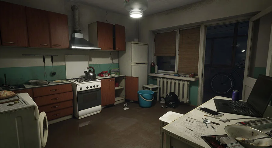
When a project needs an apartment that feels lived in rather than staged, Post Soviet Flat Offers a clear direction. The pack was developed for the Twin Soul Game demo and presents a flat based on real Russian standards, filled with objects suited to Russian life. That foundation gives artists and level designers a ready-made interior identity: not a neutral room set, but a specific domestic environment with a recognizable cultural and visual character.
The scene language is equally important. Every object shown is made in one style, which helps the apartment read as a whole place instead of a collection of unrelated props. The pack also carries a slight weariness and dilapidation across all props, giving the environment a used, believable condition that naturally supports tension, mood, and narrative framing. For teams working on horror, adventure, or shooter projects, that kind of visual consistency can do a lot of work before any character even enters the room.
Post Soviet Flat and the shape of a believable apartment
The central appeal here is its focus on a flat built according to real Russian standards. That phrase points to more than decoration. It suggests an apartment whose layout, furnishings, and daily-use objects follow a grounded domestic model rather than a generalized urban interior. For environment work, that specificity matters. It helps a scene feel placed in a real social setting, which in turn gives stronger context to exploration, traversal, and storytelling.
Because the pack includes many objects suitable to Russian life, it is especially useful when a developer wants the environment itself to carry part of the setting. Rooms do not need to rely only on architecture to communicate where the player is. Everyday items can establish routine, class, history, and atmosphere in quieter ways. In a horror scene, those details can make disruption feel sharper. In an adventure game, they can make searching and observation more engaging. In a shooter, they can keep close-quarters interiors from feeling anonymous.
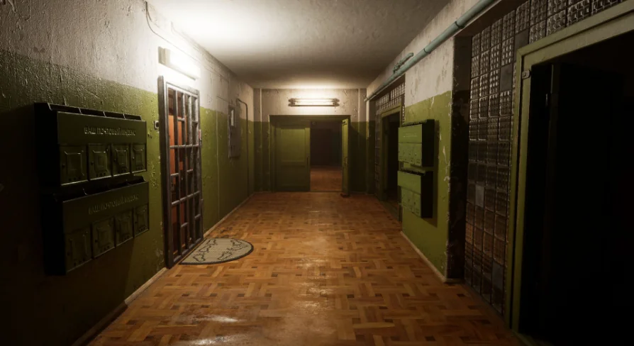
The apartment framing also gives the resource a practical role inside a larger level. A flat can operate as a full self-contained location, but it can also serve as one chapter in a wider urban sequence. A corridor can connect rooms, a kitchen can anchor domestic routine, and a bathroom can reinforce the sense of private life interrupted by conflict or fear. The tags attached to the pack point directly toward spaces such as Bathroom, Corridor, Kitchen, Room, and Apartment, which makes its scope legible even without turning it into a generic interior set.
Twin Soul roots and a scene made in one style
Since the pack was developed for the Twin Soul Game demo, it comes from a context where the environment needed to work as part of an actual game presentation rather than as an isolated study. That background is useful for developers thinking about scene cohesion. The props shown in the scene are designed in one style, so they support a shared visual language across the apartment instead of competing with one another.
Consistency like this can shape how the environment is used creatively. A unified style keeps attention on mood and layout. It lets lighting, pacing, and player movement become stronger scene tools because the room is not visually fragmented by mismatched objects. If a designer wants to stage a reveal through a hallway, frame a tense encounter in a kitchen, or build suspense in a worn room, the shared styling helps the sequence feel intentional.
It also gives artists a stable base when dressing spaces. A room can be made denser or more restrained without losing its identity, because the objects already belong to the same visual world. That is especially relevant in projects where domestic interiors need to support repeated visits, environmental storytelling, or layered tension across multiple scenes. The apartment can feel inhabited and coherent even before gameplay logic is added.
Slight weariness and dilapidation as a playable mood
All props in the pack carry a slight weariness and dilapidation. The wording is modest, and that matters. This is not described as total ruin or extreme destruction. The atmosphere comes from visible use, age, and decline rather than collapse. That makes the pack versatile within its stated genres.
For horror, slight decay can be more effective than spectacle. A room that still resembles ordinary life but shows signs of neglect often creates stronger unease than one that is already fully destroyed. The player reads the place as familiar first, then notices the erosion. That shift can sharpen dread without requiring exaggerated visual drama.
For adventure projects, the same worn quality can support slower observation. Objects with signs of use help a flat feel inhabited by a past or present life. They can suggest routine, absence, or interruption, which gives exploration more emotional texture. A scene can invite attention simply because the condition of the environment hints at history.
In a shooter, wear and dilapidation can toughen an interior without stripping it of realism. Rooms still function as domestic spaces, but they also feel credible as contested or vulnerable locations. That balance is useful when close-range combat needs environmental character instead of blank utility. The apartment does not have to become abstract cover geometry to feel game-ready.
Horror, adventure, and shooter use without changing the apartment's identity
The pack is presented as perfectly suitable for a AAA class game in the genres of Horror, Adventure, or Shooter. Those genres ask for different pacing, but this apartment supports each of them through the same core strengths: a specific real-world standard, a full scene of matching props, and a worn visual tone.
In horror, the apartment can function as an intimate pressure zone. Domestic rooms narrow the gap between player and environment, which makes sound, movement, and visual detail feel close. The corridor tag hints at transitional spaces where tension can build between rooms. The room and bathroom tags suggest enclosed areas where vulnerability can be heightened. The Soviet and horror tags together place the pack in a distinctly moody register.
In adventure work, the same flat can become a place of discovery. A kitchen or room can carry the sense of everyday life interrupted, while a corridor can turn simple movement into a sequence of reveals. Because the props share one style, environmental clues can feel like part of the same world rather than scattered set dressing.
In shooters, the apartment reads as a believable interior level. The level and apartment tags support that interpretation directly. A flat gives natural chokepoints, room-to-room progression, and shifts between open and enclosed spaces. The slight weariness of the props helps the setting retain personality under pressure instead of feeling polished or generic.
Where Post Soviet Flat fits best
Post Soviet Flat Is best suited to projects that need a Russian-standard apartment with a grounded domestic feel and a lightly deteriorated surface. Its strongest qualities are specificity and cohesion: many objects suited to Russian life, all shown in one style, all carrying the same mild wear and dilapidation. That combination makes it a strong fit for developers building interior scenes where place and mood need to do real narrative work.
If the goal is a believable apartment for horror, adventure, or shooter scenes, this pack offers a direct route. It is not defined by flashy variety or by a detached prop library approach. Its value sits in giving a flat a consistent identity from room to room, with the atmosphere of use already present in the environment.
 Interior
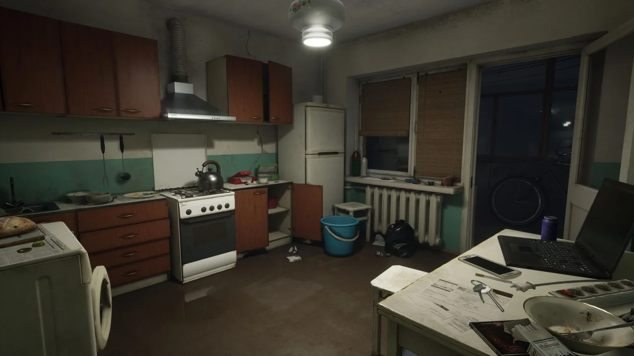
 Interior
 Interior
 Apocalyptic