"1f00f67f9253451b"{"id":"1000928","slug":"pro-icon-pack-survival","title":"Pro Icon Pack: Survival","category":"Icons","engine":"4.26+,5.0+","assetVersion":"","engineVersion":"Engine Version: 4.26+,5.0+","tag":"Icons","accent":"blue","visual":"mech","summary":"Survival-themed UI icons for inventories, HUDs, and main menu screens. Use them as a flexible base to build or extend your own icon set.","platform":"Unreal Engine","publishedAt":"2026-08-09T15:24:13.690Z","updatedAt":"2026-08-09T15:24:13.690Z","sourceNotes":[],"fileContents":[],"compatibility":["Unreal Engine","Engine Version: 4.26+,5.0+"],"featuredImage":{"alt":"Pro Icon Pack: Survival","src":"/wp-content/uploads/published/2026/08/7e0743a954f7-6d6e5f76-7b2b-4777-843b-53d39752210c-4cedfa33f3.webp"},"hasDownloadLink":true,"downloads":1,"terms":[{"taxonomy":"category","slug":"icons","name":"Icons"}],"galleryImages":[{"src":"/wp-content/uploads/published/2026/08/d760b9f2af47-4f6e417b-50a0-4e28-8c2a-7c2aed74bd91-514e44122b.webp","alt":"Pro Icon Pack: Survival"},{"src":"/wp-content/uploads/published/2026/08/ab9b09ef98b2-99bb5289-146f-437a-8246-9ba918cff323-8751d7a075.webp","alt":"Pro Icon Pack: Survival"},{"src":"/wp-content/uploads/published/2026/08/d99d70ef1e30-0e88d61c-e004-4d06-b35e-24c5abbabb37-8656e15aa8.webp","alt":"Pro Icon Pack: Survival"},{"src":"/wp-content/uploads/published/2026/08/605b56384d61-a4344182-4fd2-454c-9914-97e36a00b4ab-be65f589cb.webp","alt":"Pro Icon Pack: Survival"},{"src":"/wp-content/uploads/published/2026/08/b76639eeb6bf-125d0701-4067-4691-9f92-2fe8d028dd31-952d3f3f7b.webp","alt":"Pro Icon Pack: Survival"},{"src":"/wp-content/uploads/published/2026/08/c6d2b6b34055-7efa53af-5092-40f0-9a69-3bbe1089df17-e5953f683d.webp","alt":"Pro Icon Pack: Survival"},{"src":"/wp-content/uploads/published/2026/08/f60656c5622a-e738e30c-c38f-46ea-aa50-287a5898726d-1bca973471.webp","alt":"Pro Icon Pack: Survival"}],"accessPanel":{"kind":"resource","title":"Download this resource","eyebrow":"Free Download","message":"Log in or create a free account to start your download.","fileName":"Content.7z","safetyNote":"Resources are manually reviewed before listing to improve quality and reduce obvious risks.","actionLabel":"Download Free","resourceType":"Resource archive"},"contentHtml":"\u003cp\u003eIn a survival game, the player is often juggling multiple systems at once: checking hunger and thirst, sorting loot in a backpack, scanning the health bar, and navigating menus to craft or save. Each of those interactions depends on instantly readable icons. \u003cem\u003ePro Icon Pack: Survival\u003c/em\u003e is built for exactly those moments. It supplies a set of icons that fit into \u003ccode\u003eInventory\u003c/code\u003e screens, Heads-Up Display (HUD) readouts, and \u003ccode\u003eMain Menu\u003c/code\u003e layouts, with enough flexibility to be used as a starting point for a project's own visual language.\u003c/p\u003e\n\n\u003ch2\u003eReadable Icons for the Systems Survival Players Watch Most\u003c/h2\u003e\n\n\u003cp\u003eSurvival interfaces tend to be dense. The player is not just fighting enemies; they are monitoring resources, managing equipment, and making quick decisions about what to keep or discard. Icons carry a large part of that communication. \u003cem\u003ePro Icon Pack: Survival\u003c/em\u003e aims to make those decisions faster by putting clear, survival-themed icons where players look most often: \u003ccode\u003eInventory\u003c/code\u003e grids, \u003ccode\u003eHUD\u003c/code\u003e status elements, and the \u003ccode\u003eMain Menu\u003c/code\u003e navigation.\u003c/p\u003e\n\n\u003cp\u003eBecause the pack is labeled around the survival genre, the visual direction leans toward the materials, tools, and conditions that players in those games expect. That keeps the icon set consistent with the game's atmosphere from the 1st moment the User Interface (UI) appears. Instead of relying on abstract shapes and generic symbols, the icons reflect the emergencies and tasks that define survival gameplay.\u003c/p\u003e\n\n\u003ch2\u003eFrom \u003ccode\u003eInventory\u003c/code\u003e to \u003ccode\u003eHUD\u003c/code\u003e: A Design System That Moves Across Screens\u003c/h2\u003e\n\n\u003cp\u003eThe pack is not limited to 1 part of the interface. The available details explicitly ties it to 3 areas: \u003ccode\u003eInventory\u003c/code\u003e, \u003ccode\u003eHUD\u003c/code\u003e, and \u003ccode\u003eMain Menu\u003c/code\u003e. Those 3 areas cover a large share of a survival game's \u003ccode\u003eUI\u003c/code\u003e surface area.\u003c/p\u003e\n\n\u003cp\u003e\u003ccode\u003eInventory\u003c/code\u003e screens benefit from icons that read clearly at small sizes, because slots are usually packed tightly. \u003ccode\u003eHUD\u003c/code\u003e elements need icons that stand out against changing backgrounds, whether the player is in a dark forest or a sunlit clearing. The \u003ccode\u003eMain Menu\u003c/code\u003e requires icons that communicate progression, settings, and story entries without demanding extra text explanations. Having 1 pack cover all 3 spaces means a team can keep a unified visual style across the entire interface rather than mixing multiple icon sources.\u003c/p\u003e\n\n\u003cp\u003eThis also simplifies the production pipeline. A designer can drop the icons into 1 single style pass and know that the \u003ccode\u003eInventory\u003c/code\u003e, \u003ccode\u003eHUD\u003c/code\u003e, and menu will feel like parts of the same game. For an indie team or a small group working on a survival title, that is a practical efficiency that reduces cleanup time later.\u003c/p\u003e\n\n\u003ch2\u003eA Base to Extend, Not a Shut-and-Sealed Set\u003c/h2\u003e\n\n\u003cp\u003e1 of the most useful qualities of this pack is that it does not try to be the final word on your game's iconography. The description makes it clear that the pack can be used directly or as a base to add your own icons. That changes how a team can approach it.\u003c/p\u003e\n\n\u003cp\u003eRather than treating the icons as fixed assets that must be used exactly as provided, the pack positions itself as a flexible design tool. A team can place a new icon style into the same framework, expanding the set with weapons, environmental hazards, or unique local elements that are specific to their game. This is especially important in the survival genre, where every title has its own twist—maybe a temperature system, a radiation gauge, or a specialized crafting tree. The base icons cover the common needs, and the open structure lets developers build outward without starting from a blank canvas.\u003c/p\u003e\n\n\u003cp\u003eIt is also a smart approach for prototyping. Early in production, functional icons can be dropped in immediately. Later, an artist can redraw any icon in the set while keeping the same layout and visual weight. The pack works as a scaffolding for the final art.\u003c/p\u003e\n\n\u003ch2\u003eCompatibility with \u003cem\u003ePro Main Menu V3\u003c/em\u003e\u003c/h2\u003e\n\n\u003cp\u003eFor teams already using the \u003cem\u003ePro Main Menu V3\u003c/em\u003e system, the compatibility note matters. The editor notes explicitly point to this integration, meaning the icon pack is designed to work within that menu framework. That saves time on the technical side, as the icons should slot into the menu's existing structure without needing custom \u003ccode\u003eUI\u003c/code\u003e code.\u003c/p\u003e\n\n\u003cp\u003ePairing the pack with \u003cem\u003ePro Main Menu V3\u003c/em\u003e gives a developer a ready-to-use menu presentation with icons that already fit the survival context. Instead of sourcing icons separately and trying to align them with the menu's layout and interaction logic, the team can rely on a set that was made with that compatibility in mind.\u003c/p\u003e\n\n\u003cp\u003eThis is a useful detail for teams that have already standardized on that menu tool. The icon pack extends the visual language of the menu without requiring a redesign of the menu itself. It also suggests that the pack sits comfortably in a production pipeline where \u003ccode\u003eUI\u003c/code\u003e components are expected to connect to existing modular kits.\u003c/p\u003e\n\n\u003ch2\u003eDemo Video and Documentation: 2 Resources That Shorten the Learning Curve\u003c/h2\u003e\n\n\u003cp\u003eThe pack ships with practical support material: a Demo Video and Documentation. For a \u003ccode\u003eUI\u003c/code\u003e asset, these are not just extras; they directly affect how quickly a designer can get results. The Demo Video gives a quick look at the icons in action, showing how they behave across the intended screens. The Documentation offers the reference needed for integrating the icons into a project, covering the details that are easier to write down than to show.\u003c/p\u003e\n\n\u003cp\u003eTeams evaluating the pack can use these resources to confirm that the icons will fit their \u003ccode\u003eUI\u003c/code\u003e setup before committing to a full integration. For developers who are new to building survival interfaces, the Documentation serves as a guide for placement and customization. For experienced \u003ccode\u003eUI\u003c/code\u003e artists, the same material helps them map the icons to their own code and layout structure without going through a lengthy trial-and-error phase.\u003c/p\u003e\n\n\u003cp\u003eHaving both visual reference and written guidance is a small sign that the pack is meant to be used, not just purchased. It lowers the barrier for entry and lets the team focus on the look of the game rather than on deciphering the asset structure.\u003c/p\u003e\n\n\u003ch2\u003eWhere This Pack Sits in a Real Production Workflow\u003c/h2\u003e\n\n\u003cp\u003e\u003cem\u003ePro Icon Pack: Survival\u003c/em\u003e is not an exotic, niche tool. It is a workhorse asset for the kind of repetitive \u003ccode\u003eUI\u003c/code\u003e work that every survival game faces. Early on, it gives prototypes and vertical slices a coherent visual layer. Later, it holds up as the foundation for a final icon set, with room for custom additions.\u003c/p\u003e\n\n\u003cp\u003eThe pack also respects the way game \u003ccode\u003eUI\u003c/code\u003e is actually built: in stages. An \u003ccode\u003eInventory\u003c/code\u003e icon is not just an image; it is a small communication tool that has to work with tooltips, keyboard navigation, and controller prompts. A \u003ccode\u003eHUD\u003c/code\u003e icon must be legible while the game is moving and the player is under stress. A \u003ccode\u003eMain Menu\u003c/code\u003e icon needs to convey meaning before the player reads the label. This pack addresses those specific needs without trying to solve every \u003ccode\u003eUI\u003c/code\u003e problem at once.\u003c/p\u003e\n\n\u003cp\u003eFor a team that wants to keep its interface work moving quickly, the strongest takeaway is this: the icons work in the places where survival players already look, they are built to be customized, and the compatibility with \u003cem\u003ePro Main Menu V3\u003c/em\u003e removes 1 more integration headache. Starting from that point, a team can spend less time building basic icons from scratch and more time shaping the icons that will give their game a unique identity.\u003c/p\u003e\n\n\u003ch2\u003eMore From The Same Workflow\u003c/h2\u003e\n\u003cul\u003e\n\u003cli\u003e\u003ca href=\"https://3dcghub.com/clean-flat-gui-elements/\" title=\"Clean Flat GUI Elements\"\u003eClean Flat GUI Elements\u003c/a\u003e\u003c/li\u003e\n\u003cli\u003e\u003ca href=\"https://3dcghub.com/hyper-mesh-to-icon-creator-v4/\" title=\"Hyper Mesh to Icon Creator v4\"\u003eHyper Mesh to Icon Creator v4\u003c/a\u003e\u003c/li\u003e\n\u003cli\u003e\u003ca href=\"https://3dcghub.com/250-sci-fi-flat-icons/\" title=\"250 Sci-fi Flat Icons\"\u003e250 Sci-fi Flat Icons\u003c/a\u003e\u003c/li\u003e\n\u003cli\u003e\u003ca href=\"https://3dcghub.com/fantasy-rpg-icons-500-fantasy-fantasy-rpg-icon-icon-symbol-symbol-rpg/\" title=\"Fantasy RPG Icons (500+) ( Fantasy Fantasy Rpg Icon Icon Symbol Symbol Rpg )\"\u003eFantasy RPG Icons (500+) ( Fantasy Fantasy Rpg Icon Icon Symbol Symbol Rpg )\u003c/a\u003e\u003c/li\u003e\n\u003cli\u003e\u003ca href=\"https://3dcghub.com/hand-painted-weapon-equipment-icons-weapon-icons-equipment-icons-rpg-icons/\" title=\"Hand Painted Weapon \u0026amp; Equipment Icons (Weapon Icons, Equipment Icons, RPG Icons)\"\u003eHand Painted Weapon \u0026amp; Equipment Icons (Weapon Icons, Equipment Icons, RPG Icons)\u003c/a\u003e\u003c/li\u003e\n\u003c/ul\u003e","contentTextLength":7490,"navigation":{"current":401,"total":3222,"previous":{"id":"1000929","slug":"simple-activations","title":"Simple Activations","category":"Gestures","platform":"Unreal Engine","updatedAt":"2026-08-09T15:28:22.798Z"},"next":{"id":"1000927","slug":"post-apocalyptic-melee-weapons-vol-1-post-apocalyptic-apo-survival-weapon","title":"Post Apocalyptic Melee Weapons VOL.1 ( Post Apocalyptic Apo Survival Weapon )","category":"Weapons \u0026 Combat","platform":"Unreal Engine","updatedAt":"2026-08-09T15:18:38.769Z"}},"relatedResources":[{"id":"15412","slug":"clean-flat-gui-elements","title":"Clean Flat GUI Elements","category":"Icons","engine":"4.26+,5.0+","assetVersion":"Engine version: 4.26+,5.0+","engineVersion":"4.24","tag":"Icons","accent":"blue","visual":"city","summary":"Enhance your project with Clean Flat GUI Elements, featuring over 4,000 vector icons and 6,000 shapes. This high-quality pack includes PNG and PSD files for versatile game development.","platform":"Unreal Engine","publishedAt":"2026-03-12T08:57:23.000Z","updatedAt":"2026-04-19T15:44:47.000Z","sourceNotes":[],"fileContents":[],"compatibility":["Unreal Engine","Engine version: 4.26+,5.0+"],"featuredImage":{"alt":"Clean Flat GUI Elements","src":"https://3dcghub.com/wp-content/uploads/2026/03/7ad47f28-2bf8-4982-b7cc-3fa30329a6f0.webp"},"hasDownloadLink":true,"downloads":0},{"id":"15423","slug":"hyper-mesh-to-icon-creator-v4","title":"Hyper Mesh to Icon Creator v4","category":"Icons","engine":"5.3+","assetVersion":"Engine version: 5.3+","engineVersion":"5.3","tag":"Icons","accent":"blue","visual":"mech","summary":"Transform your 3D models into professional 2D inventory icons with Hyper Mesh to Icon Creator v4. This local, fast tool eliminates the need for external software like Photoshop.","platform":"Unreal Engine","publishedAt":"2026-03-12T08:59:30.000Z","updatedAt":"2026-04-19T15:44:47.000Z","sourceNotes":[],"fileContents":[],"compatibility":["Unreal Engine","Engine version: 5.3+"],"featuredImage":{"alt":"Hyper Mesh to Icon Creator v4","src":"https://3dcghub.com/wp-content/uploads/2026/03/039f2623-933b-49aa-8be1-20241fe7049c.webp"},"hasDownloadLink":true,"downloads":1},{"id":"15384","slug":"250-sci-fi-flat-icons","title":"250 Sci-fi Flat Icons","category":"Icons","engine":"5.0+","assetVersion":"Engine version: 5.0+","engineVersion":"5.0","tag":"Icons","accent":"blue","visual":"luts","summary":"Enhance your game's interface with the 250 Sci-fi Flat Icons pack. Designed for PC and mobile platforms, these 512x512 assets cover everything from combat to necromancy.","platform":"Unreal Engine","publishedAt":"2026-03-12T08:55:10.000Z","updatedAt":"2026-04-19T15:44:47.000Z","sourceNotes":[],"fileContents":[],"compatibility":["Unreal Engine","Engine version: 5.0+"],"featuredImage":{"alt":"250 Sci-fi Flat Icons","src":"https://3dcghub.com/wp-content/uploads/2026/03/d586d80c-2703-4c47-85e7-6731d088a943.webp"},"hasDownloadLink":true,"downloads":0}]}
Icons
Pro Icon Pack: Survival
Survival-themed UI icons for inventories, HUDs, and main menu screens. Use them as a flexible base to build or extend your own icon set.
Category:Unreal Engine,IconsPlatform: Unreal EngineEngine Version: 4.26+,5.0+Published: Aug 9, 2026
Icons
Resource overview
In a survival game, the player is often juggling multiple systems at once: checking hunger and thirst, sorting loot in a backpack, scanning the health bar, and navigating menus to craft or save. Each of those interactions depends on instantly readable icons. Pro Icon Pack: Survival is built for exactly those moments. It supplies a set of icons that fit into Inventory screens, Heads-Up Display (HUD) readouts, and Main Menu layouts, with enough flexibility to be used as a starting point for a project's own visual language.
Readable Icons for the Systems Survival Players Watch Most
Survival interfaces tend to be dense. The player is not just fighting enemies; they are monitoring resources, managing equipment, and making quick decisions about what to keep or discard. Icons carry a large part of that communication. Pro Icon Pack: Survival aims to make those decisions faster by putting clear, survival-themed icons where players look most often: Inventory grids, HUD status elements, and the Main Menu navigation.
Because the pack is labeled around the survival genre, the visual direction leans toward the materials, tools, and conditions that players in those games expect. That keeps the icon set consistent with the game's atmosphere from the 1st moment the User Interface (UI) appears. Instead of relying on abstract shapes and generic symbols, the icons reflect the emergencies and tasks that define survival gameplay.
From Inventory to HUD: A Design System That Moves Across Screens
The pack is not limited to 1 part of the interface. The available details explicitly ties it to 3 areas: Inventory, HUD, and Main Menu. Those 3 areas cover a large share of a survival game's UI surface area.
Inventory screens benefit from icons that read clearly at small sizes, because slots are usually packed tightly. HUD elements need icons that stand out against changing backgrounds, whether the player is in a dark forest or a sunlit clearing. The Main Menu requires icons that communicate progression, settings, and story entries without demanding extra text explanations. Having 1 pack cover all 3 spaces means a team can keep a unified visual style across the entire interface rather than mixing multiple icon sources.
This also simplifies the production pipeline. A designer can drop the icons into 1 single style pass and know that the Inventory, HUD, and menu will feel like parts of the same game. For an indie team or a small group working on a survival title, that is a practical efficiency that reduces cleanup time later.
A Base to Extend, Not a Shut-and-Sealed Set
1 of the most useful qualities of this pack is that it does not try to be the final word on your game's iconography. The description makes it clear that the pack can be used directly or as a base to add your own icons. That changes how a team can approach it.
Rather than treating the icons as fixed assets that must be used exactly as provided, the pack positions itself as a flexible design tool. A team can place a new icon style into the same framework, expanding the set with weapons, environmental hazards, or unique local elements that are specific to their game. This is especially important in the survival genre, where every title has its own twist—maybe a temperature system, a radiation gauge, or a specialized crafting tree. The base icons cover the common needs, and the open structure lets developers build outward without starting from a blank canvas.
It is also a smart approach for prototyping. Early in production, functional icons can be dropped in immediately. Later, an artist can redraw any icon in the set while keeping the same layout and visual weight. The pack works as a scaffolding for the final art.
Compatibility with Pro Main Menu V3
For teams already using the Pro Main Menu V3 system, the compatibility note matters. The editor notes explicitly point to this integration, meaning the icon pack is designed to work within that menu framework. That saves time on the technical side, as the icons should slot into the menu's existing structure without needing custom UI code.
Pairing the pack with Pro Main Menu V3 gives a developer a ready-to-use menu presentation with icons that already fit the survival context. Instead of sourcing icons separately and trying to align them with the menu's layout and interaction logic, the team can rely on a set that was made with that compatibility in mind.
This is a useful detail for teams that have already standardized on that menu tool. The icon pack extends the visual language of the menu without requiring a redesign of the menu itself. It also suggests that the pack sits comfortably in a production pipeline where UI components are expected to connect to existing modular kits.
Demo Video and Documentation: 2 Resources That Shorten the Learning Curve
The pack ships with practical support material: a Demo Video and Documentation. For a UI asset, these are not just extras; they directly affect how quickly a designer can get results. The Demo Video gives a quick look at the icons in action, showing how they behave across the intended screens. The Documentation offers the reference needed for integrating the icons into a project, covering the details that are easier to write down than to show.
Teams evaluating the pack can use these resources to confirm that the icons will fit their UI setup before committing to a full integration. For developers who are new to building survival interfaces, the Documentation serves as a guide for placement and customization. For experienced UI artists, the same material helps them map the icons to their own code and layout structure without going through a lengthy trial-and-error phase.
Having both visual reference and written guidance is a small sign that the pack is meant to be used, not just purchased. It lowers the barrier for entry and lets the team focus on the look of the game rather than on deciphering the asset structure.
Where This Pack Sits in a Real Production Workflow
Pro Icon Pack: Survival is not an exotic, niche tool. It is a workhorse asset for the kind of repetitive UI work that every survival game faces. Early on, it gives prototypes and vertical slices a coherent visual layer. Later, it holds up as the foundation for a final icon set, with room for custom additions.
The pack also respects the way game UI is actually built: in stages. An Inventory icon is not just an image; it is a small communication tool that has to work with tooltips, keyboard navigation, and controller prompts. A HUD icon must be legible while the game is moving and the player is under stress. A Main Menu icon needs to convey meaning before the player reads the label. This pack addresses those specific needs without trying to solve every UI problem at once.
For a team that wants to keep its interface work moving quickly, the strongest takeaway is this: the icons work in the places where survival players already look, they are built to be customized, and the compatibility with Pro Main Menu V3 removes 1 more integration headache. Starting from that point, a team can spend less time building basic icons from scratch and more time shaping the icons that will give their game a unique identity.
 Icons
Icons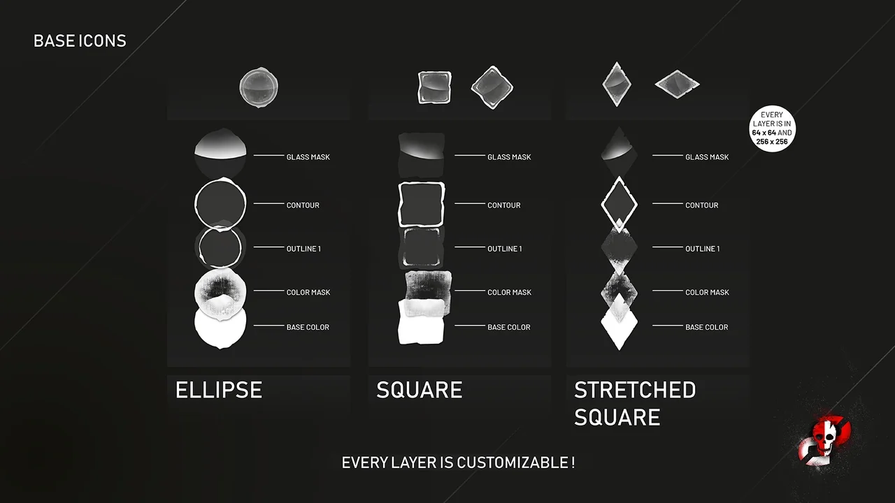
 Icons
Icons Icons
Icons Icons
Icons